Fighting with the Data
I struggled with the design of the Johns Hopkins data visualizations for the recent pandemic. Under the surface, the visualization powered by an overpriced commercial software known as ArcGIS. I tried to work with the data myself and got some basic visualizations working. Along the way, I started to see some other great visualizations, and some that were terrible. The data is collected in time series by day, but it’s measured inconsistently depending on the reporting guidelines of each country or region. This gives the data some unusual aspects we’ve never really encountered before.
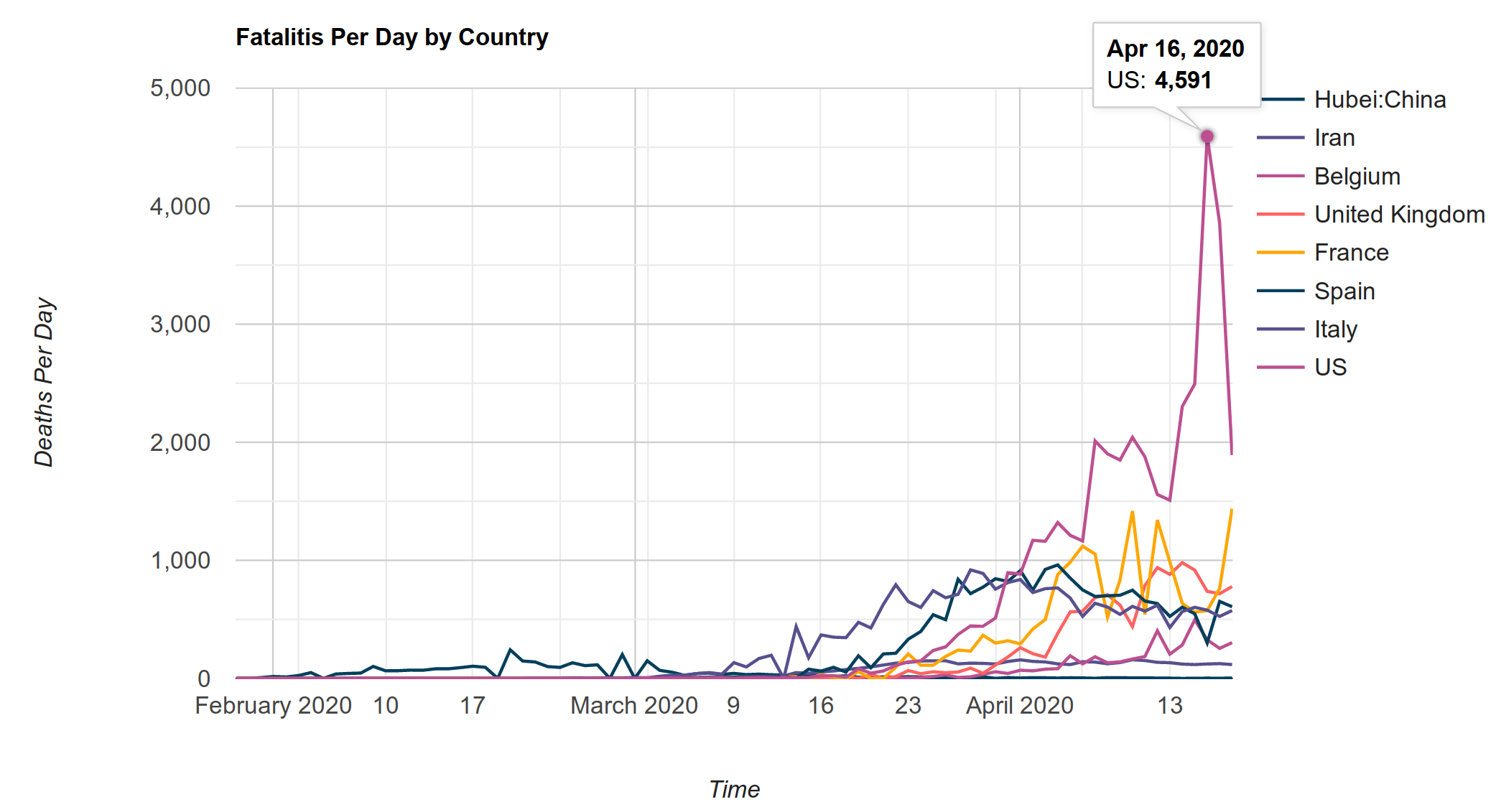
On April 16th, the deaths per day for the state of New York spiked to 4,591, where it was around 2,000 before and immediately after. New York retroactively adjusted several previous fatalities which were likely caused COVID-19. The reasoning for this change is based around average death rates for the year far exceeding what is typical1, and a similar under-reporting may have taken place in Italy2. The trouble with this spike in relation to the Johns Hopkins data is that it’s tacked onto the end of the time series instead of being applied to the dates when those deaths occurred3.
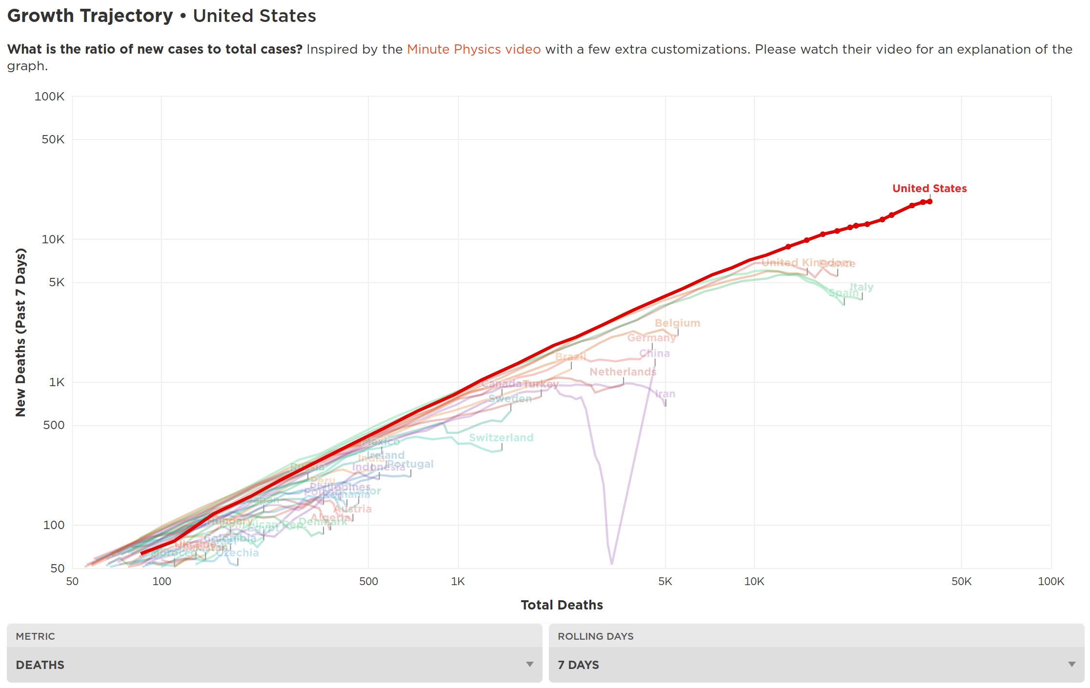
This spike for the US is misleading, and it can be clearly seen either side of the spike shows a decline. That’s why the Logarithmic project by Aatish Bhatia is so vitally important. On a logarithmic scale, minor data variations don’t really affect the overall trend. This snapshot, taken from the website Covidly which was inspired by Bhatia’s work, shows that the United States fatality curve seems to be starting to flatten out4.
True exponential growth in the real world does not go on forever. At some point the growth does have to slow, either through containment of the virus or everyone being infected5. Predicting when an exponential growth will end, especially while you’re in one, is difficult. Predictions are currently affecting the actions of leaders around the world, with great potential consequences.
Please Stop Comparing Time Series to Yearly Averages
I saw the following graph shared by someone on social media6. It’s terribly misleading because it tries to take the total number of deaths from previous years, divide it by time periods, and map it as a straight line to indicate the average number of deaths per period.
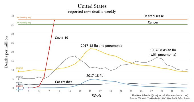
Static averages across a one year time period are completely different from daily time series data that has only been reported on for a few months. They aren’t truly comparable without twelve full months of COVID-19 mortality data. Exponential trends do reach an end since there are a finite number of human beings a virus can infect. The following animation makes the same mistake, comparing COVID-19 time series data over just a few months against static averages over the course of an entire year7. If this animation were to be made in the future and continue, the yellow bar would most likely go back down the graph after the virus infection peaks.
Trying to compare exponential time series data for a few months, against any type of yearly average, is a straight up dishonest visualization. It’s not comparing like types. At the end of a 12 month period, the time series data could be reduced to the same flat line, bellow where an exponential spike would occur early on.
Controls
There have been a lot of calls for the world to unify and act unilaterally against this disease. In the face of disaster, it’s understandable to desire that every country do whatever they can to minimize loss of life. Unfortunately, if every country follows the same guidelines, we cannot have true scientific analysis of our actions, because we’ve eliminated any control groups.
Letting a region of the world go without mitigating the disease seems like something out of Aldous Huxley’s novel Brave New World. In Huxley’s world, this experiment would have happened in secret, lead by the controllers. But is it unethical if it’s done in plain sight with the population’s knowledge? In Sweden, schools, restaurants and move theaters are open, although the maximum capacity of most places is limited and tables are spaced further apart. Neighboring Denmark is sheltering in place, but Sweden is attempting to not shut down the country entirely, so long as their hospital systems can keep up with the currently influx of cases8. In the United States, eight states delayed shelter in place orders for weeks9, and Georgia is about to end several of its restrictions10.
The decision of some leaders to not act unilaterally may lead to different outcomes, but the results won’t be known, or actionable, for several months or years. In six months, what if Sweden’s numbers are absolutely no different from the United Kingdom’s or Germany? What if their numbers are disastrous, but US states who delayed measures are better? What if Sweden’s numbers are disastrous for three months, but completely fine for the rest of the year, whereas all their neighbors continue to see waves of cases for months to come? What if COVID-19 has been in the general population for much longer than we suspected, effectively reducing the mortality rates, which may very well be the case in California11?
Many in Sweden were concerned about their government’s approach, but then began to vehemently defend their actions once the Trump administration began to criticize it12. Sweden is asking people to work from home, isolating their elderly and at risk populations, and taking actions, just not as strictly as other countries8. There are a lot of different variables and the situation is constantly changing. Our news media fills us with constantly changing absolutes, which may be setting unreasonable expectations on a lot of the ongoing research at this point.
Incentives
There is evidence that Italy may have not counted several fatalities that should have been considered COVID-19 related2, and New York has added to their numbers based on the same discrepancy between previous yearly averages and what’s happening right now. Even when everyone is acting in good faith, all of this could just fall under a reasonable margin of error, so long as there aren’t any additional motives to misreport the data.
Dr. Scott Jensen, a medical doctor and a state senator for Minnesota, has talked about such incentives. A standard Medicare reimbursement, known as a DRG, for a death related to pneumonia, is $4,60013. If that same fatality gets classified as COVID-19, the hospital could be reimbursed for $13,000. If the patient is put on a ventilator, that could grow to $39,00014.
Hopefully, incentives like Medicare and others, won’t cause health care providers to inflate or deflate numbers. However, such considerations do need to be taken into account when examining the data.
Is It All About the Numbers?
First, if you want to work directly with the data, take a look at COVID-19-tools. The project started off as basic tooling, but has changed to visualize data specifically for Greece. Still, the python code for data extraction and manipulation from the Johns Hopkins data is very clean and I wish I had started with it on my own project. The Johns Hopkins data has a lot of legacy weirdness, such as time series dates listed as columns, and countries being grouped together except for China, which is split out by region.
There are a lot of strong politics opinions already forming over both the data and the actions of world and regional leaders, and those trends will likely continue. In the United States, politicians who were originally admonishing the president for travel restrictions, claiming xenophobia, have now acknowledged the seriousness of the situation, while still not admitting to being inconsistent in their opinions15. People are free to their opinions, but we must be weary of political affiliations leading us to bias about what we see in the data.
It’s really too early to determine anything concrete about COVID-19. We live in a data driven society where we expect immediate feedback. Big Data is the new Big Oil and people are expecting to see the types of projections and predictions seen in science fiction movies. However, the real world does not contain discrete sets of aligned data. The real world is messy and filled with noise. Much of the data today will need to be filtered, evaluated and argued over. We truly won’t know anything until at least a year from now, and more like two to three years from now. Making any statements about the effectiveness or ineffectiveness of any mitigation strategy at this point, makes for good news, but might not be reliable or verifiable.
-
The Problem with New York City’s COVID-19 Death-Rate Estimates. 15 April 2020. McCarthy. National Review. ↩
-
The real death toll for Covid-19 is at least 4 times the official numbers. 26 March 2020. Corriere Della Sera. ↩ ↩2
-
INCORRECT DATA FOR New York Fatalities #2257. mirny. GitHub Issue Tracker. Retrieved 20 April 2020. ↩
-
Covidly.com. Retrieved 20 April 2020. ↩
-
Exponential growth and epidemics. 8 March 2020. 3Blue1Brown. (Video) ↩
-
kravietz - privacytools.io. 17 April 2020. Kravietz. Privacytools.io. ↩
-
Covid vs. US Daily Average Cause of Death. 8 April 2020. Estrella. Video Retrieved 20 April 2020. ↩
-
‘They are leading us to catastrophe’: Sweden’s coronavirus stoicism begins to jar . 30 March 2020. Robertson. The Guardian. ↩ ↩2
-
‘This will blow over’: In states without stay-at-home orders, Americans celebrate freedom as death toll climbs. 2 April 2020. Cava. USA Today. ↩
-
Georgia’s reopening is a high-stakes public health bet – and will likely please Trump. 21 April 2020. Collinson. CNN. ↩
-
Dr. John Ioannidis Announces Results of COVID-19 Serology Study. 19 April 2020. Journeyman Pictures. (Video) ↩
-
Sweden says Trump criticism of virus strategy ‘factually wrong. 8 April 2020. Reuters. Yahoo News. ↩
-
Animated No Agenda - It Pays for Itself!. 17 April. Animated No Agenda. (Video) ↩
-
Dr. Jensen calls out ‘ridiculous’ CDC guidelines for coronavirus-related deaths. 9 April 2020. Fox News. ↩
-
Nancy Pelosi on negotiations over small business relief program, criticism of Trump’s plan to reopen nation. Wallace. 19 April 2020. ↩