Using Custom CSS with Mastodon

Mastodon has an option for applying custom CSS from within its administration panel. Unfortunately, I couldn’t find any examples of what this CSS should look like, even after asking in the Mastodon Fourms. I did discover how tricky modifying Mastodon CSS can be. I couldn’t figure out why changes to the body element wouldn’t affect anything, and was informed that Mastodon draws to a component with the .ui class. Through some careful work with the Firefox development tools, I was able to figure out which CSS selectors controlled what, and have tried to build a list for getting started with creating themes in Mastodon via a custom style sheet.
Here’s a table of all the important CSS selectors I adjusted for my custom theme. There are three main layouts in Mastodon: The Landing Page (for non-logged in users), the User Interface (when logged in) and the Profile Page (public page for a user). Few of the CSS classes are shared across pages.
| CSS Selector | Element it Styles | Page |
|---|---|---|
| .ui | Primary content box for logged in user | UI |
| .search__input | Search Input Box | UI |
| .search-results | Search Results Box | UI |
| .search-results__header | Header for Search Results | UI |
| .search-results__section h5 | Section Titles for Search Results | UI |
| .account__section-headline | Bar under profile with Toots / Replies / Media | UI |
| .status-link | Links within statuses | UI |
| .account__header > div | Area for tinting User Profiles | UI |
| .account__header .account__header__fields dt | User profile keys | UI |
| .account__header .account__header__fields dd | User profile values | UI |
| .status__content | Text content within individual status | UI |
| .reply-indicator__content | Text for reply indication content | UI |
| .column | Individual column (opacity useful for transparency) | UI / Landing |
| .column-header | Header for Column | UI |
| .column-header__button | Settings/Hamburger Button on Columns | UI |
| .column-back-button | Back Button / Timeline heading on Landing | UI / Landing |
| .hero-widget__text | Can’t Remember | UI |
| .drawer__inner | Top half of the composition column | UI |
| .drawer__inner__mastodon | Bottom region with Mastodon logo | UI |
| .drawer__inner__mastodon img | Mastodon Send logo image | UI |
| .drawer__header | Top Left Control Box | UI |
| article | Element for most statuses | UI |
| .status-public | Background for public statues (default theme colors public/private the same) | UI |
| .status.status-direct:not(.read) | Unread direct messages | UI |
| .column > .scrollable | Bar under profile with Toots / Follows / Followers | UI |
| .column-link | Links in Getting Started Menu | UI |
| .column-link:hover | Hover in Getting Started Menu | UI |
| .column-subheading | Getting Started Menu Section Headings | UI |
| .column-header__back-button | Local timeline Back Button | UI |
| .status-reply | Statuses that are Replies | UI |
| .detailed-status | Focused Status Opened in Side Column | UI |
| .detailed-status__action-bar | Reply / Boost / Star Bar under Detailed Status | UI |
| .getting-started | Getting Started Box | UI |
| .landing-page | Primary content box for main site | Landing Page |
| .landing-page__information | Center/Lower Info Boxes | Landing Page |
| .landing-page__forms | Login/Register Box | Landing Page |
| .landing-page__call-to-action | User/Status count box | Landing Page |
| .public-layout | Primary content box for profiles | Profile Page |
| .activity-stream .entry | Background for statuses on public profile | Profile Page |
| .public-layout .public-account-bio | Box under User Profile fields | Profile Page |
| .public-layout .header | Header above profile | Profile Page |
| .public-layout .footer | Footer below toots | Profile Page |
| .public-account-bio .account__header__fields dt | User profile keys | Profile Page |
| .public-account-bio .account__header__fields dd | User profile values | Profile Page |
This list may not be exhaustive, as I discovered some of these selectors while finding gaps in my theme. Different color patterns may require additional selectors, but this should still be a good start.
Logos
The easiest way to customize the Mastodon logo under the composition box is to set the display value of the img tag to none and then add in a custom logo as a background image. Setting the background-size to cover will allow the image to shrink and expand like the original logo.
.drawer__inner__mastodon {
  background-image: url("https://example.com/images/logo.png");
  background-size: contain;
  background-color: #0f2a54;
  opacity: 0.95;
}

.drawer__inner__mastodon img {
  display: none;
}
Light Themes
I briefly started down the path of a light theme, but then decided on a darker pallet. For a light theme, the text color for most elements needed to be changed from white to black with something like the following:
.ui p, .landing-page p, .public-layout p {
  color: black !important;
}
.status__content, .reply-indicator__content {
  color: black;
}
Public Profile Margins
For some reason, the public page layout is pushed down 10 pixels from the top. If you add a custom background image, you do get a black bar. There is no element above the top box, except the html tag itself, so trying to fix this would affect the two other layouts. I found it easier to just adjust the margins for the .public-layout element and square off the radii for headers and footers.
.public-layout {
  margin-top: -10px;
}
.public-layout .header {
  background-color: #243d63;
  border-top-left-radius: 0px;
  border-top-right-radius: 0px;
}

.public-layout .footer {
  background-color: #243d63;
  padding: 15px;
  border-top-left-radius: 10px;
  border-top-right-radius: 10px;
}
These modifications are only necessary if using a background image, and can be avoided by using just a background color.
Account Profile
Viewing a user’s profile is another oddity when it comes to themeing. For the background photo in a user’s profile to have the correct color theme, you must apply a style to .account__header > div and you must use the rgba() notation as background-color will colorize the entire bounding region including the account header fields. The final value is the opacity which affects the tint applied to the background image of the profile you are viewing.
.account__header > div {
  background: rgba(27, 42, 69, 0.9);
}
Designing Your Theme
The background should be set against all three page types. This can be split up if you want different background types for the different parts of the site, but if you want something uniform, your code will look like the following:
.ui, .landing-page, .public-layout {
  background-image: url("https://cdn.example.com/images/background.jpg");
  background-size: cover;
  background-repeat: no-repeat;
  background-position: center;
}
Many of the classes listed in the table above will have a simple background color or a text color. It’s best to pick a color pallet first and then assign elements in groups to those colors, like so:
.account__header .account__header__fields dd,
.public-account-bio .account__header__fields dd,
.drawer__inner, .drawer__inner__mastodon {
  background-color: #0f2a54;
}
Sapphire Ocean Theme
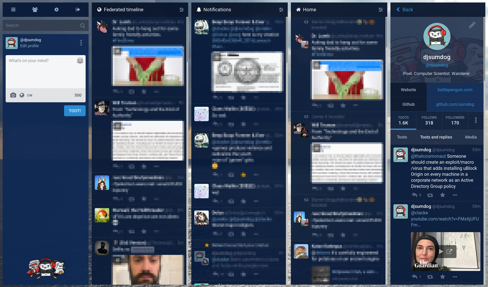
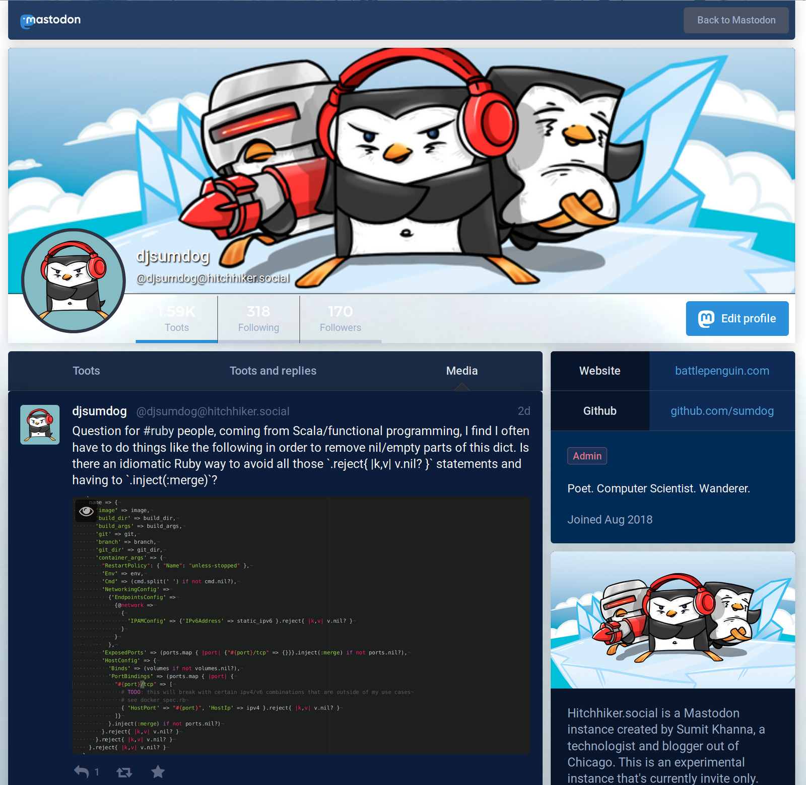
Here is the Sapphire Ocean v1.0 theme I created for my personal instance, Hitchhiker.Social. The CSS code is public domain, and the background image is available under the Creative Commons BY-NC-SA license. Please copy and host the background yourself if you wish to use this theme. You can easily store the background in Mastodon permanently by keeping it in a pinned toot.
Screenshots


Color Pallet

Source Code
.search__input {
  background-color: #343f51;
}

.search-results {
  background-color: #182a3c;
}

.landing-page__forms, .public-layout .header,
.public-layout .footer {
     background-color:#243d63;
}

.landing-page__call-to-action, .detailed-status {
  background-color:#213759;
}

.public-layout {
  margin-top: -10px;
}

.public-layout .header {
  border-top-left-radius: 0px;
  border-top-right-radius: 0px;
}

.public-layout .footer {
  padding: 15px;
  border-top-left-radius: 10px;
  border-top-right-radius: 10px;
}

.ui, .landing-page, .public-layout {
  background-image: url("https://example.org/background.jpg");
  background-size: cover;
  background-repeat: no-repeat;
  background-position: center;
}

.account__section-headline, .column-header__back-button {
  background-color: #1b2a45 !important;
}

.status-link {
  color: #73a9d1 !important;
}

.account__header > div {
  background: rgba(27, 42, 69, 0.9);
}

.account__header .account__header__fields dt, .public-account-bio .account__header__fields dt,
.column-header, .column-header__button, .column-back-button, .hero-widget__text, .status.status-direct:not(.read) {
  background-color: #08152b;
}

.account__header .account__header__fields dd,
.public-account-bio .account__header__fields dd,
.drawer__inner, .drawer__inner__mastodon {
  background-color: #0f2a54;
}


.column {
  background-color: transparent;
  opacity: 0.95;
}

article, .status-public, .activity-stream .entry, .column > .scrollable,
  .drawer__header, .landing-page__information {
  background-color: #0b1d3a;
}

.column-link {
  color:#8ba9c7;
  background-color:#1e2a3e;
}

.column-link:hover {
  background-color: #21314b;
}

.status-reply {
  background-color: #071a3a;
}

.detailed-status__action-bar {
  background-color:#1c2d49;
}

.getting-started, .public-layout .public-account-bio {
  background-color: #002b55;
}

.column-subheading, .search-results__header, .search-results__section h5 {
  background-color: #002549;
  color: #7398bc;
}

.drawer__inner, .drawer__inner__mastodon {
  opacity: 0.95;
}

.drawer__inner__mastodon {
  background-image: url("https://example.org/logo.png");
  background-size: contain;
}

.drawer__inner__mastodon img {
   display: none;
}
Final Thoughts
I’ve found it’s easiest to deploy Mastodon using the official Docker containers released by the Mastodon developers. Many of the customization tutorials I’ve found involve building custom containers from those base images and injecting the needed assets. The Custom CSS option that’s now available in the administration console seems to be a much cleaner option than modifying the base application. It’s powerful tool for creating a custom look and feel for Mastodon. I hope this tutorial provides a decent starting point for those seeking to customize Mastodon instances they administer. I’m sure there are ways to simplify the number of classes needing to be themed, and look forward to seeing what other themes people come up with.